4 min read
Your Salesforce Needs Some Design Love (Part Two) by Reilly Ellis
 Tim Lockie
:
June 13, 2018
Gestalt Principles (Why we group the things we do)
Visually, our brains like groups. They’ll take small, simple images and form them into groups. They’ll take large, complex images and break them up into groups. Our brains do this so that the information is easier to process. (Spot a trend?)
Gestalt principles explain how and why we create what groups or associations.
Used well, the gestalt principles can help make your interface easier to understand.
Used poorly, they can create confusion where people group things together that are different.
There are eight in total, but I’m going to review the most relevant below.
Laws of Similarity & Proximity
The law of similarity states that we group similar elements together.

That’s why you can easily identify the blue rectangles as one group and the yellow circles as another.
The law of proximity states that we group close things together.

That’s why we don’t see one group of blue rectangles - we see three groups separated by whitespace. In the right hand group, the yellow outline helps us mark out a subset of two squares.
The laws of proximity and similarity come into play in page layouts and field names.
Here are two page layouts. In the first one, I threw the fields onto the page. There are only nine fields, how hard can it be to understand?
On the second one, however, I considered the laws of proximity and similarity and designed the page to facilitate the users’ understanding.
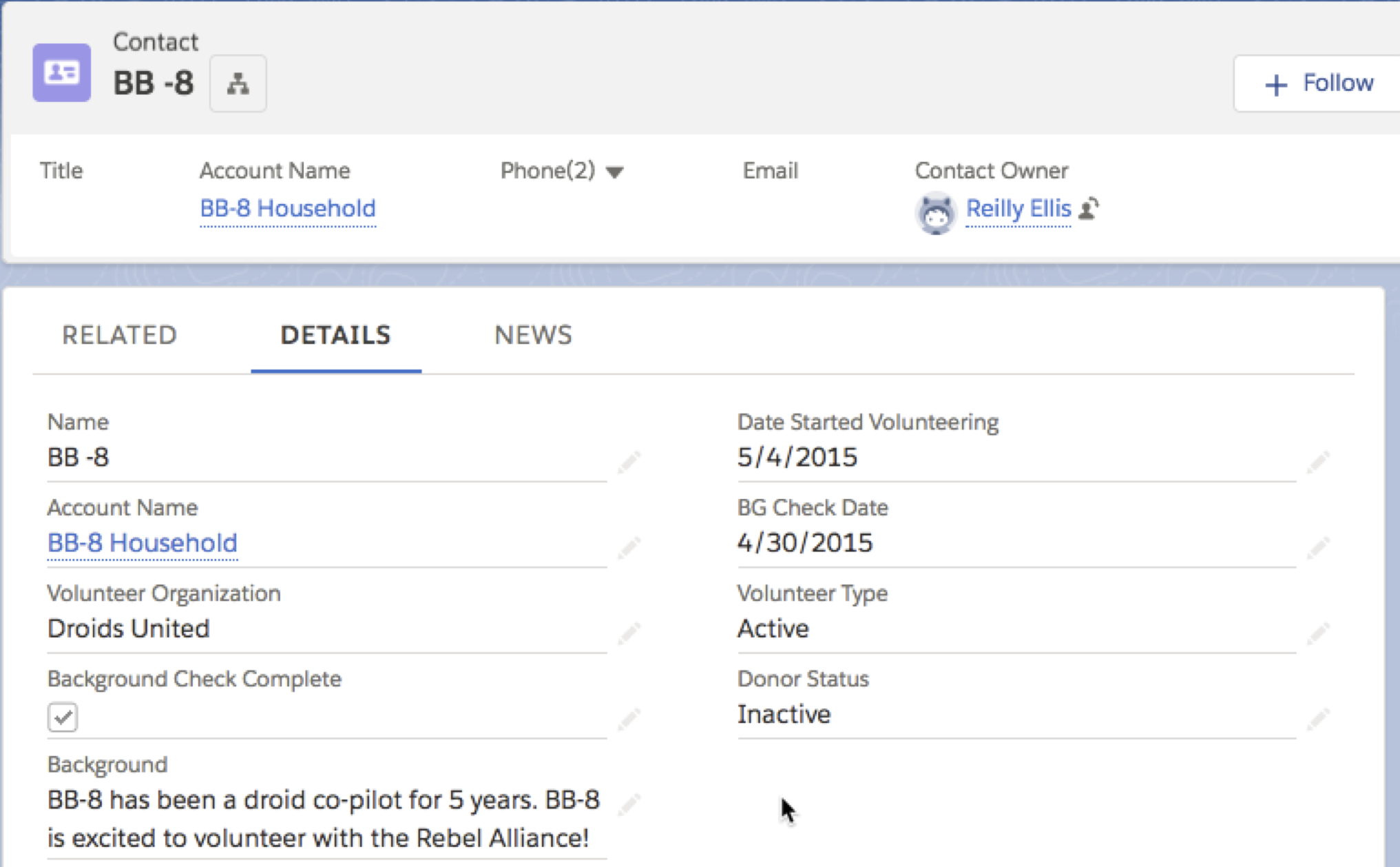 Version 1
 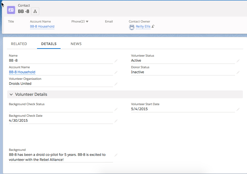 Version 2
Let’s take a closer look. The first version has some groupings, but are they what we want?
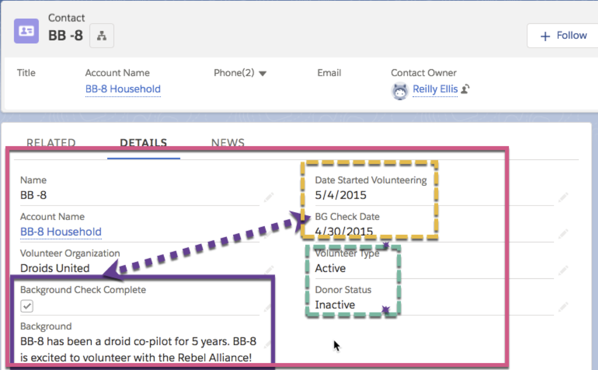
In the red box, we can see that all fields are in the same section, so they are all given the same level of importance.
In the purple box, the “Background Check Complete” and the “Background” fields are next to each other and share similar names, so they’re easy to group together. However, in this instance, the “Background” field refers to a contact’s general background instead of their background check, so that grouping is misleading.
There are some fields that I want the user to associate together, but because they’re violating the principles of proximity and similarity, it can be harder to make that connection.
The “Background Check Complete” and “BG Check Date” relate to each other, but are separated and use different names.
“Volunteer Type” and “Donor Status” are both measuring an Active/Inactive quality of the contact, but it’s harder to see them as similar measurements since their names are dissimilar.
Now that’s take a look at the second version where I used deliberate spacing and naming to facilitate different groupings.
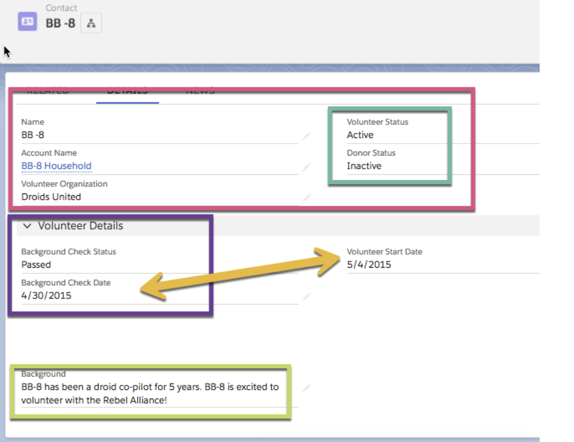
The top section is now distinct and it’s clear which fields are more important. With a name change, it’s also easy to tell that the “Volunteer Status” and “Donor Status” are measuring similar things.
The “Background Check Status” and the “Background Check Date” are next to each other and clearly associated. In turn, the “Background” field is now visually separated from the background check information, so it’s easier to keep the two meanings separate.
Just as you can create deliberate groupings with gestalt principles, you can create deliberate separations by violating the principles.
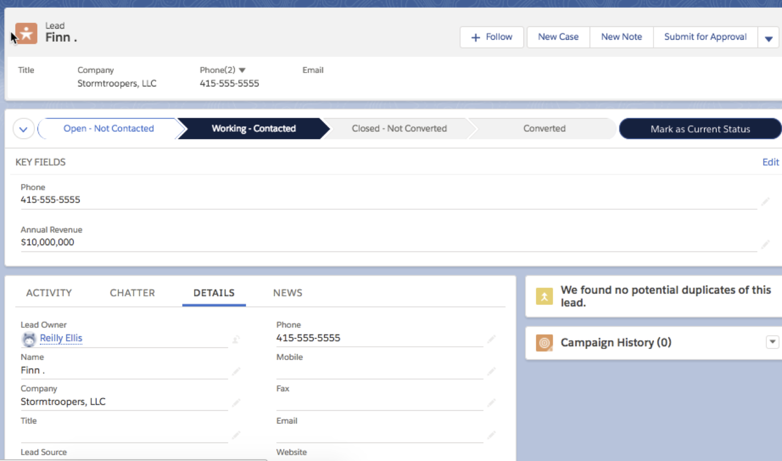
Lightning Path is a really good example. You’re visually separating the fields from the rest of the group, so it’s easier for the user to find them.
Law of Familiarity (or Past Experiences)
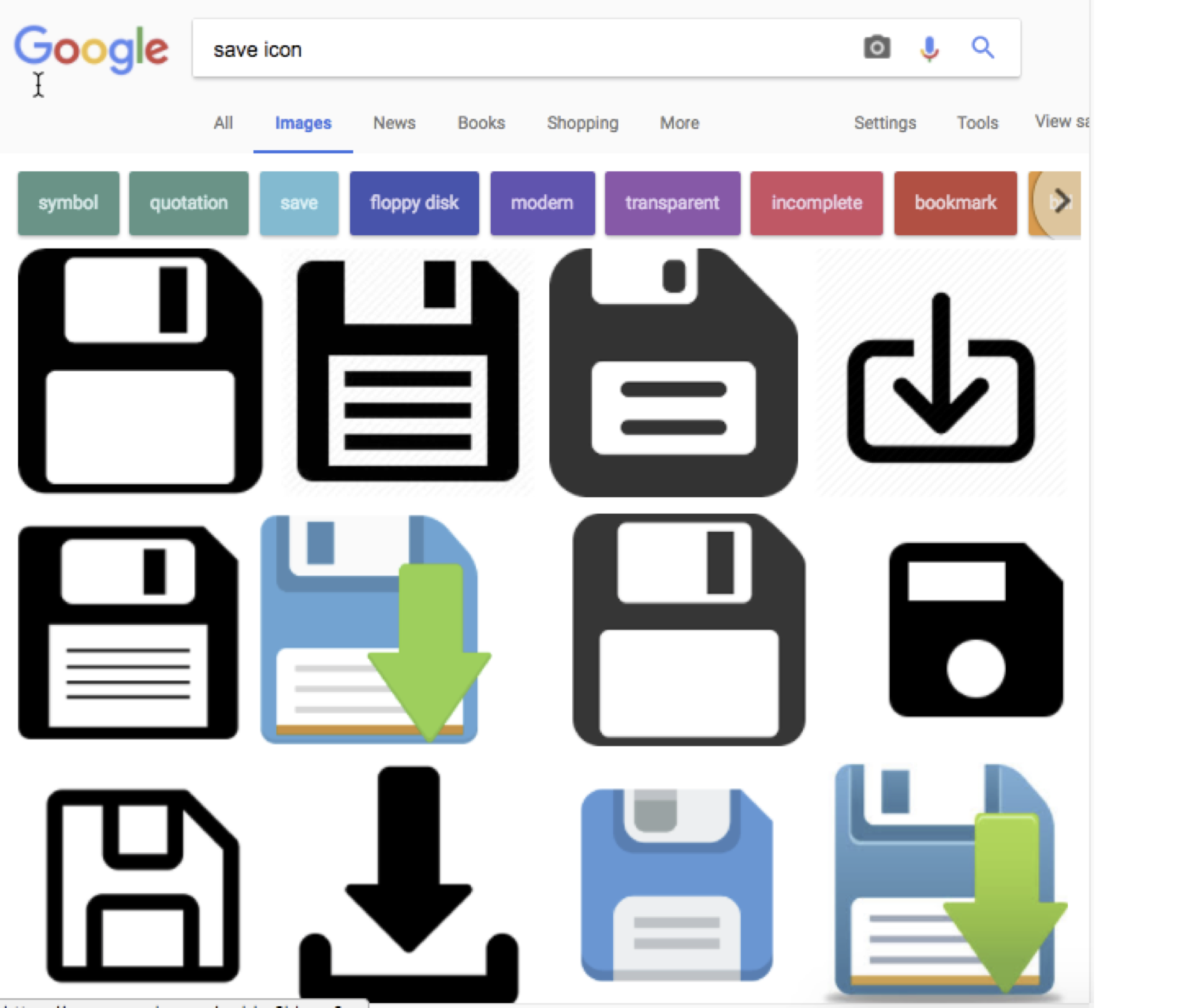
The law of familiarity says that our past influences how we see things.
That’s why, even though floppy disks haven’t been used for years, they’re still synonymous with “save.” People who have never used a floppy disk will recognize a save icon because they’re familiar with it from other systems.
This law is also why it’s important to pay attention to business process when designing your Salesforce instance. It’ll be easier for users to understand a process or layout that is familiar to them from their other work. For instance, ordering the Contact fields in the same way they’re ordered on a paper volunteer intake form.
However, the law of familiarity can tricky. It can convince you to maintain a poor design just because your users are familiar with it. Be on the lookout for this and when redesigning a page, consider the other principles first. But, if you need a tiebreaker between two good designs, go with the one that’s more familiar to your users.
The law of familiarity is the weakest gestalt principle, so chances are that your users will quickly adjust to a well-done redesign.
The emphasis here is on “well-done.”
If you’re going to do a redesign, consider it carefully. Think about the last time your favorite app did a redesign. If the new design was usable, you probably caught on quickly and appreciated the new flow. But if the new design wasn’t usable, it may have caused frustration. Not only did they did the app designers rip away your familiar associations, they didn’t give you an easy to use design to replace it.
Hick’s Law
Hick’s Law isn’t actually a gestalt principles, but it’s definitely relevant to your Salesforce design. It states that the time it takes someone to make a decision increases logarithmically with the number of choices.
Essentially, the more choices you present to your user, the longer it takes for them to find the one they want.
You can mitigate this extra time by limiting choices. You can create dependent picklists or filter your Lightning components so they only show up when relevant.
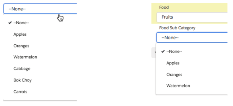 Picklists and Subcategories
You can also limit the number of choices by grouping lots of smaller choices into several larger choices.
Let’s take a look at those page layouts again through the lens of Hick’s Law.
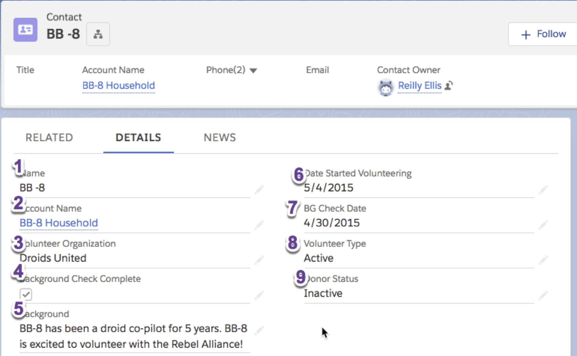
In the first one, all the fields are in the same group. So in order to choose one field, like Volunteer Start Date, you have to sort through nine options.
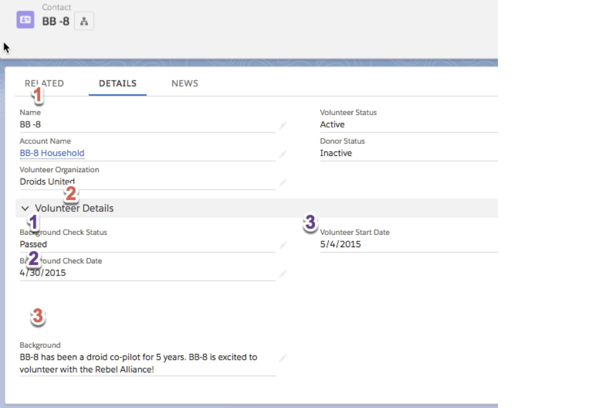
In this layout, since the sections are grouped together based on proximity, there are only a total of six choices: three to find the correct section and three to find the Volunteer Start Date field in that section.
Gestalt Principles + Hick’s Law Recap
- Design your names and page layouts to facilitate understanding of your fields.
- Try to mirror your users’ real life or previous experiences in the page layout, but don’t let your users familiarity with a poor design trick you into maintaining that poor design.
- Do your best to reduce the number of choices presented to your users through filtered Lightning components, dependent picklists, or meaningful grouping on your page.
Stay tuned for part three!


